
Stable Inc.
Welcome to your first day working in an unstable nuclear power plant.
Roles (Solo Project): Game Design, Level Design, Programming, Art Direction/Creation, Sound Design, UI/UX Design
Tools: Unity, Adobe Photoshop, Audacity
Timeline: 48 hours
Game Jam: Ludem Dare 49
Game Overview
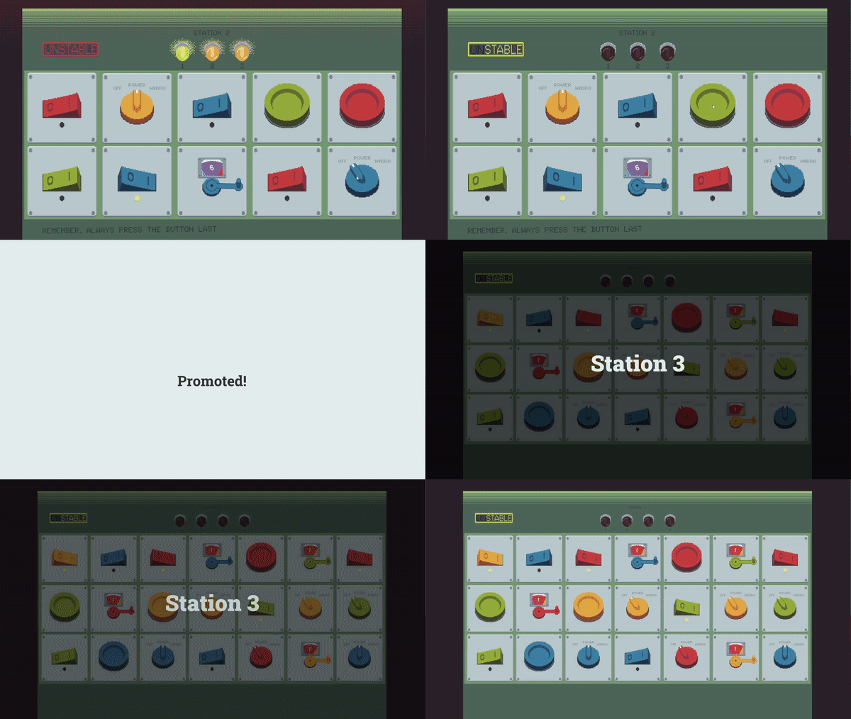
In Stable Inc, it is your first day at your new job working in an unstable nuclear power plant. However, the control stations and the error codes that appear are too complex to figure out on your own, you will need to review the manual often...
Stable Inc. features an external PDF of a reactor manual to allow players to navigate the error codes that appear on their station.
Play It here
My Work on the Project
Game Design: Concepted, prototyped, and realized a full game design in 48 hours.
Programming: Custom scripted all game functions and built a robust, modular rule system for the error codes.
Modular 2D Game Art: Designed every aspect of the game art to be reusable from the buttons and knobs to the error lights and the background which reduced the art load.
Sound Design: Recorded, edited, and implemented a satisfying array of sounds and music to accompany the tactile game elements.
Readable Document Design: I needed to ensure the external game manual was easy to use and digest for every stage of the game.
Color Blind Mode: Implemented mode to allow color blind people to enjoy the game too.
Design Challenges
Error Code Rules
Due to the vast amount of combinations 4 RGB lights can produce, I needed to find a way to distill the possibilities into a modular list of rules. The resulting rules are based on a variety of factors such as number of lights, or number of a certain color of light, all of which require different panel elements to be adjusted. This also led to the design intention of having players constantly need to change the same panels on their station. This was met by creating overlap between multiple rules that require modifications to the same panel, forcing the player to overwrite their previous work and constantly adapt.
The Need for a Readable Document
Stable Inc. heavily relies on the use of an external document to allow players to engage with the game and provide a new experience for players. However, while creating my internal list of rules for the error codes which would allow me to test the game, I began to discover the need for a beautiful, usable document.
I learned more about what this document should look like while performing playtesting. My playtesters were having a hard time in the beginning both learning the rules of the game and needing to skim through every rule in the game for early levels that didn’t involve many rules themselves. This led me to construct my final document with a segmented approach, with “chapters” for each station in the game. This allowed me to slowly introduce new mechanics in the game and the document at the same time.
According to future playtest feedback and reviews of the game, this approach, combined with all of the other small, important changes I made, makes for a seamless learning experience for players throughout the entire game.
Color Blind Mode
The various error codes, panels, and the instructions players are given throughout the game are all based on color. Because of this approach, I put the game through various color blind filters to preview the experience for color blind players. To no surprise, the game becomes almost unplayable for those with color blindless.
This led me to introduce a full color blind mode for the game which writes out the color of each element in the game and makes it playable for those those who otherwise couldn’t.
Take Aways
Experienced a full game production over the course of 48 hours.
Playtesting offers crucial information not gained otherwise and they should be used even during game jams.
Experimented with accessibility settings to remove any barriers of play.
Created satisfying game elements through the use of intuitive controls and effective sound design.
Explored and tuned effective difficulty scaling.


