

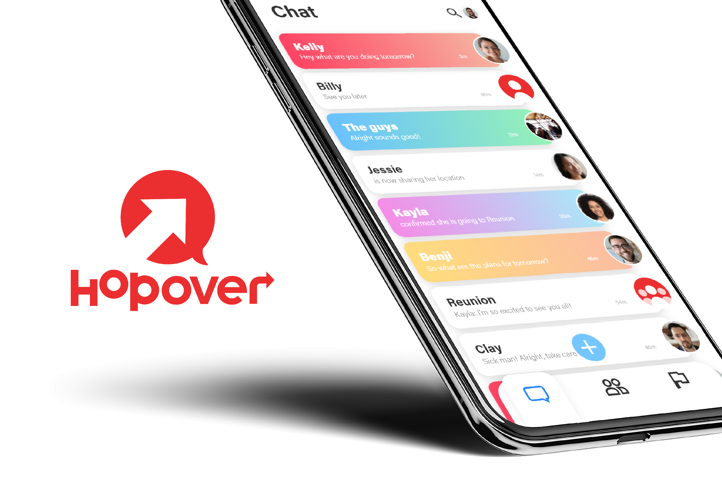
Hop Over
A chat app design and social media presence for an aspiring startup.
Team: 4
Roles: UI/UX Design, Graphic Design
Tools: Adobe Photoshop, Adobe XD
Timeline: 3 Months
Project Overview
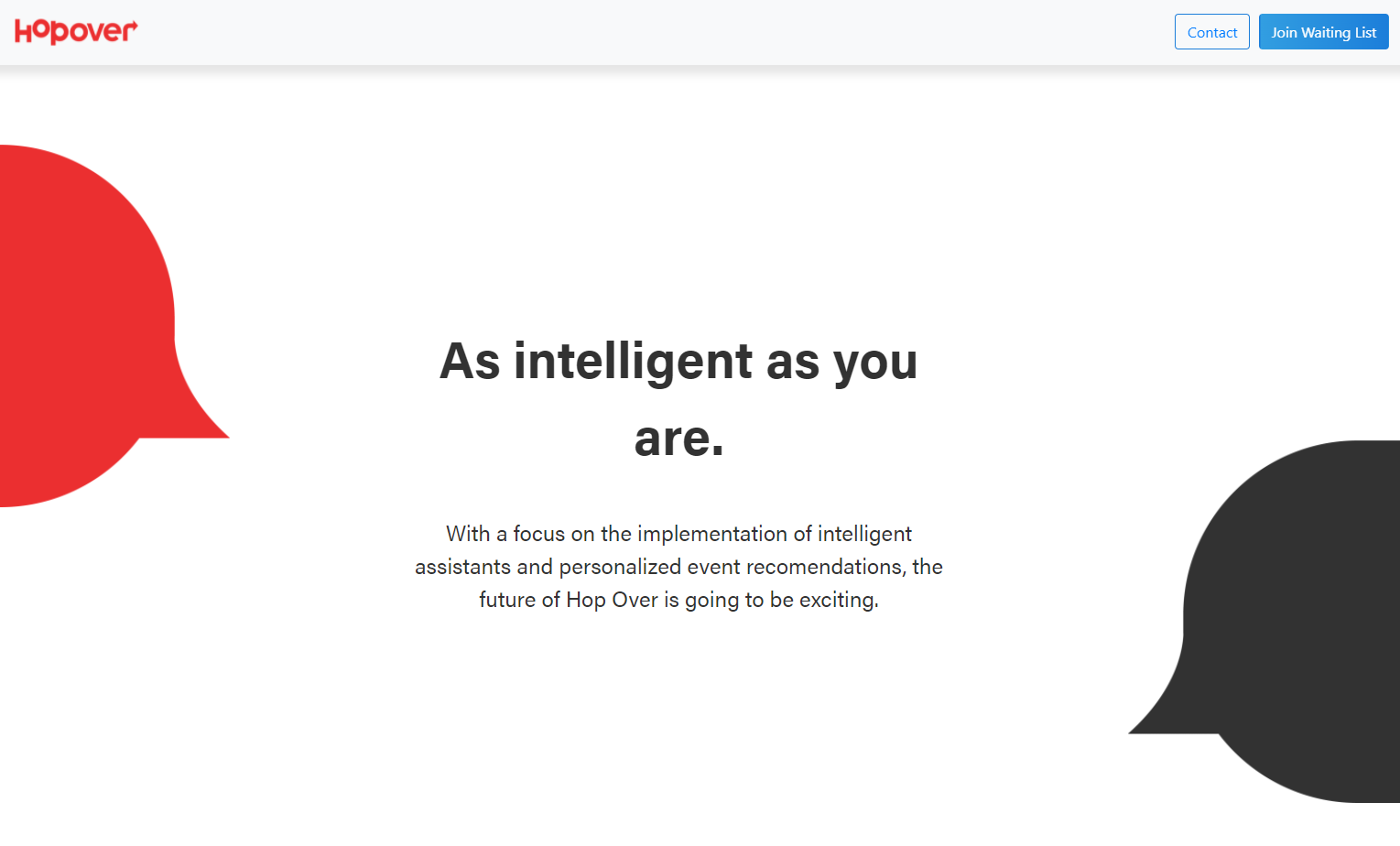
Hop Over is a chat app startup focused on building a product that is private, intuitive, and intelligent. These pillars are echoed throughout the app’s major features including secure messaging, a robust event planning section, and a Facebook Messenger group chat migration tool. My role was to design the app’s interface as well as build the team’s brand and social media presence.
My Work On The Project
App Design: Delivered UI/UX design for the apps interface.
Branding & Social Media Presence: Developed a cohesive, clean brand for the product and designed social media posts that reinforce this branding.
App Design
Overview
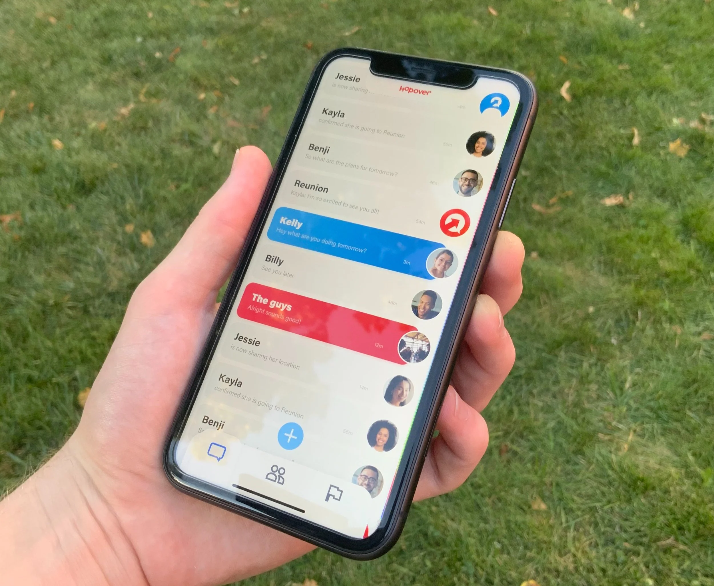
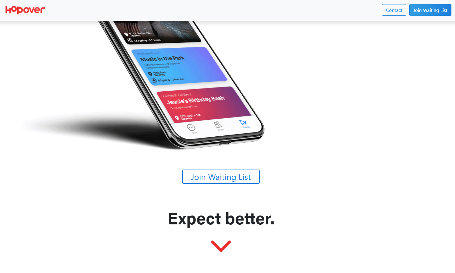
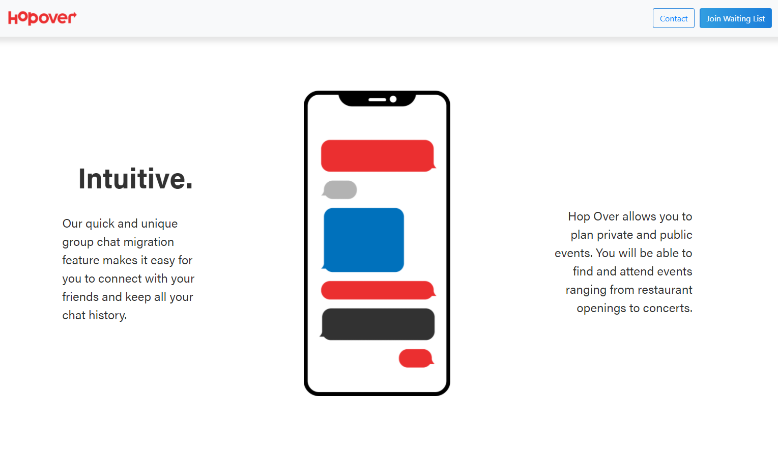
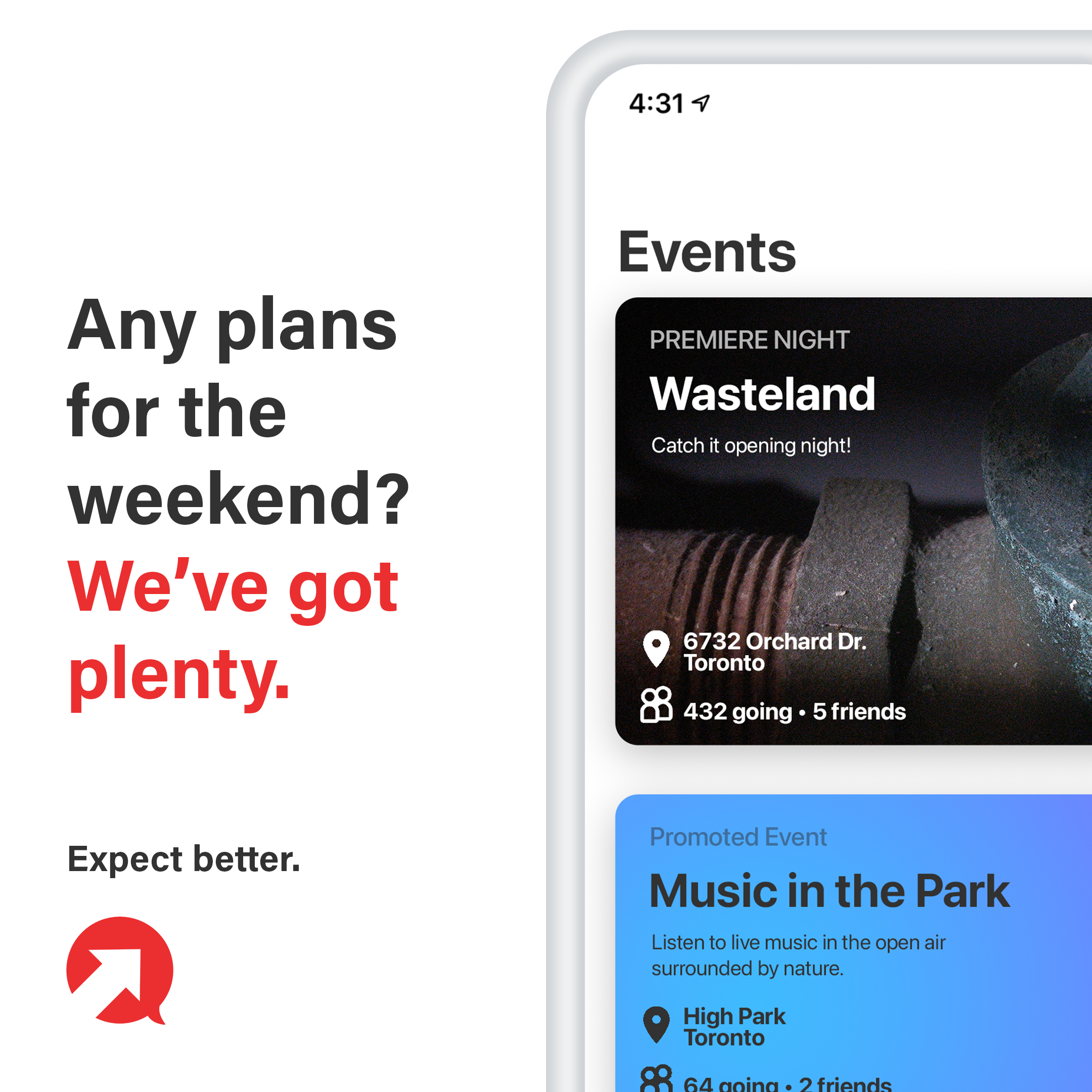
The main challenge with the app’s design was keeping it familiar to users, while also adding our own flair and emphasizing our unique features. I achieved this through a 3-tab design. Each tab works to support the app’s key pillars, with the chat tab containing our secure messaging, the people tab serving as an address book and screening process for potential contacts, and the events tab containing everything users need to find and plan cool events.

Design Process
Once I was given the design brief, I began by collecting references of other app designs and graphic design trends I liked and thought would fit this project well. From these references I established a few key elements I wanted in the design:
“Card” based UI
Maintain branding throughout app
An interesting bottom panel
These elements held throughout the revisions and served as a basis for my design decisions. While I was focused on building a beautiful interface, I was also designing an effective UX.
Some of the key experiences I had to design elegantly were:
Depicting read and unread messages.
How to create a new chat.
Integrating custom chat colors.
Event creation.
Editing group chats.
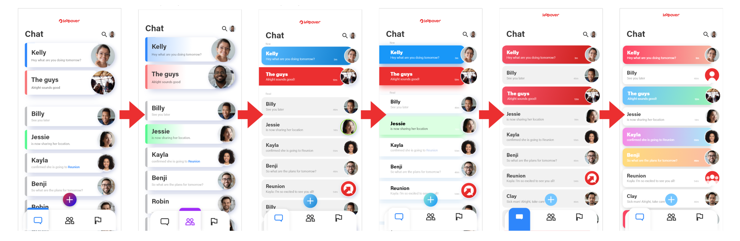
With the look of the app established, I now looked to create a process to build the many screens needed. I used a simplified wireframe method to determine what functions each screen needed before I used my established design guideline of “cards” to make each screen look unified with the rest of the app. I also worked to make it easy for the developers to implement the design with diagrams illustrating screen transitions.
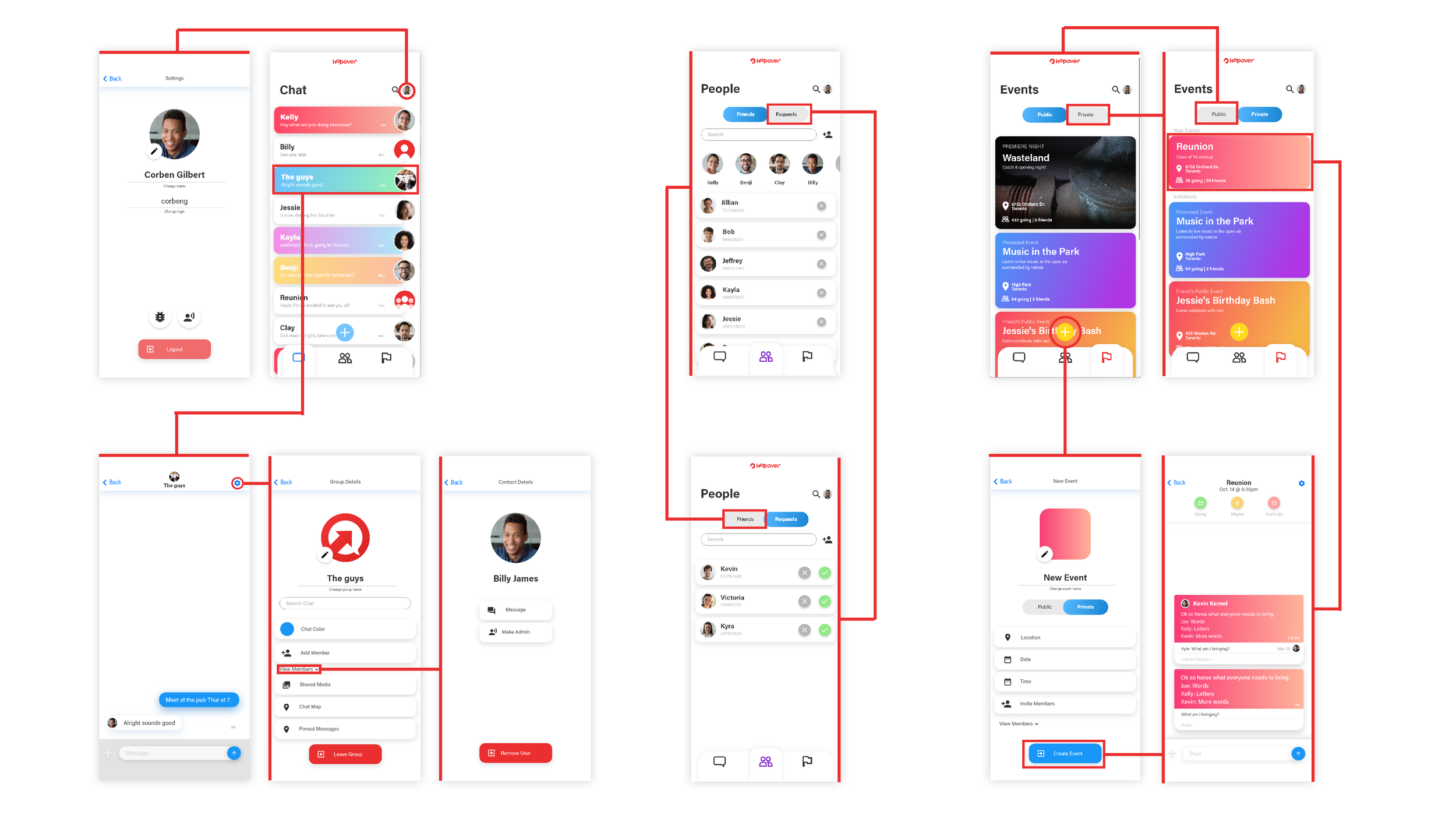
Using Adobe XD, I was able to create an interactive prototype of the app and test it’s usability with test users. This provided valuable feedback and helped inform iterations to the design to make it more naturally usable for the everyday user coming from other apps.
Branding
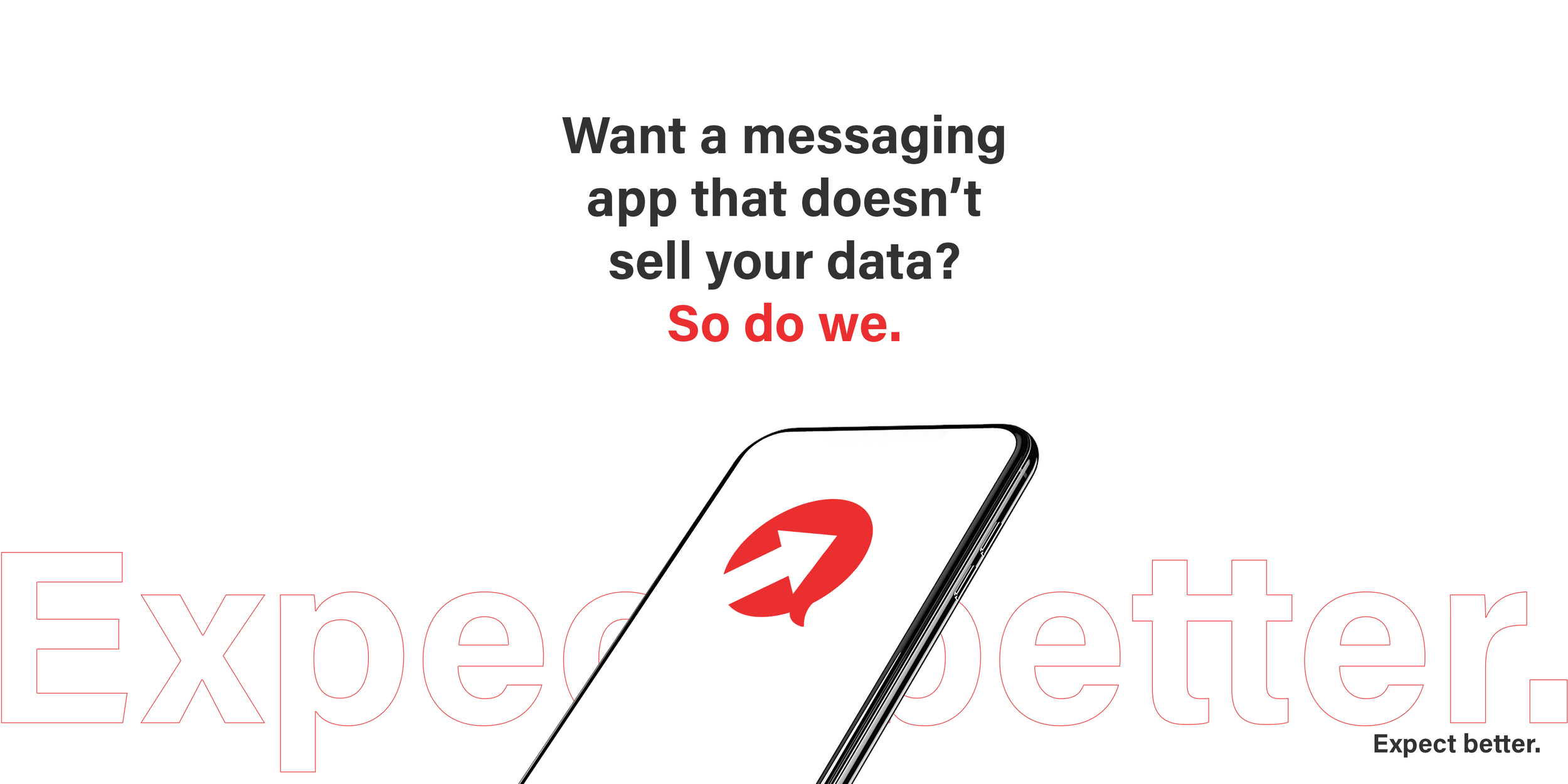
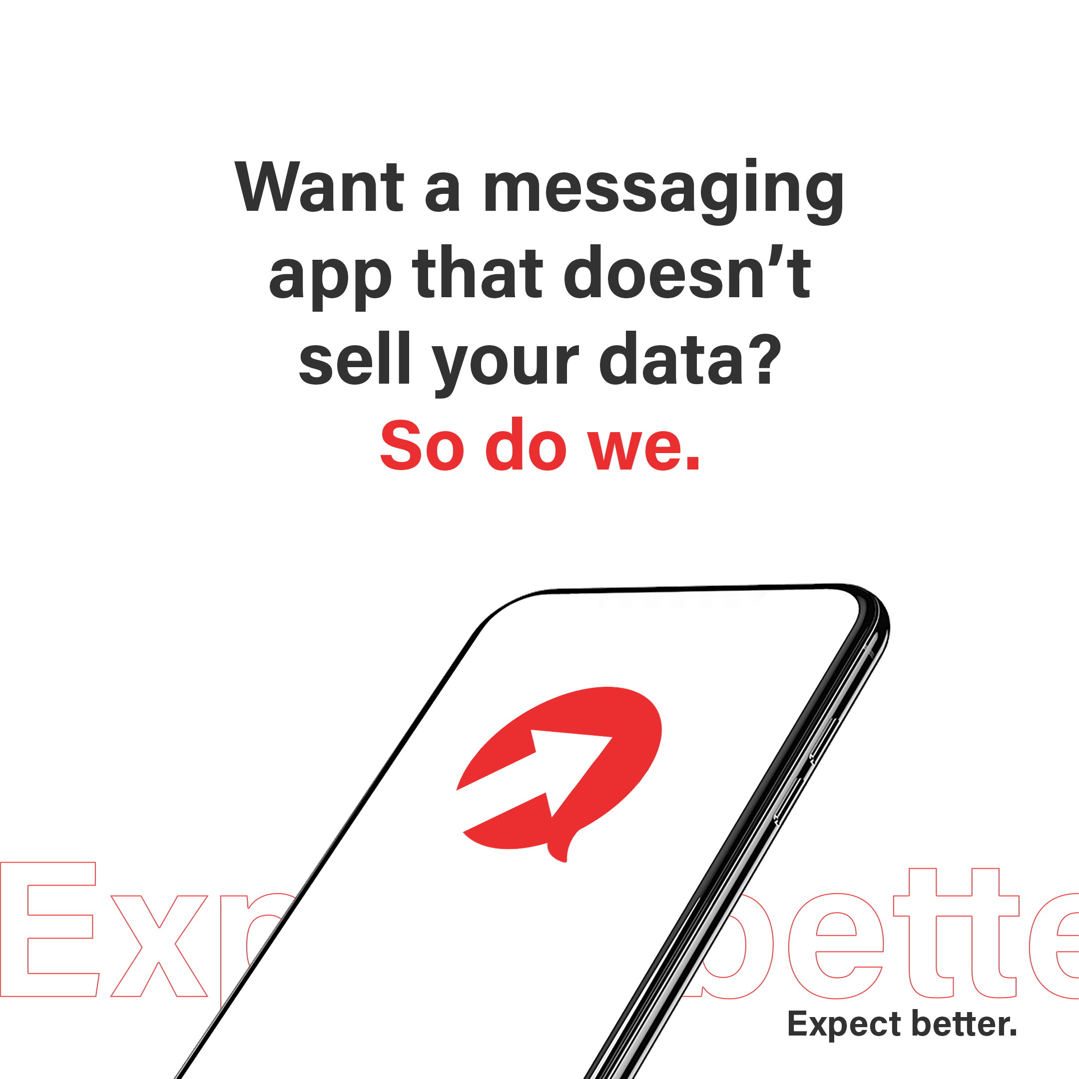
One of my first tasks with the team was to help come up with a product name and logo. We settled on Hop Over because of it’s brevity and ability to convey our goal with the product, to make a better chap app you want to “hop over” to.

I took this reasoning into the design phase where I worked to develop a logo and icon that effectively conveys the product in an instant.
I explored many options for the look and feel of the brand, but we chose the chat bubble with the arrow as we thought it best signified our goal of pushing messaging further.
I also developed the slogan of “Expect better” as both a call to action and a rip at our competition and their policies we are actively working against.
Graphic Design
I also worked with my established branding to design the team’s website and social media posts.
Hop Over Website
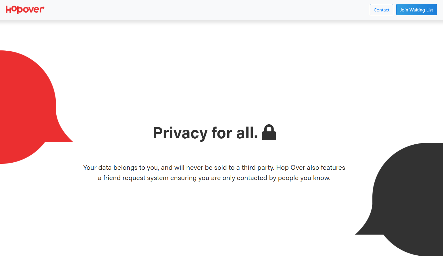

Social Media Posts


Hop Over is currently still in development.
Take Aways
Experienced a multidisciplinary app development cycle.
Strong, consistent branding and/or design elements make unified designs incredibly easy to make.
Developed a full app design using UI/UX principles.