Dev Log
Building A Cohesive Control Scheme for Multiple Platforms
From the very start of development on our capstone project – an action-adventure game where you play as a golf ball – we thought about bringing it to mobile because of the mobile-friendly controls and more casual style of gameplay. A few months into the project, we finally tried making a mobile build and it was working almost perfectly! However, a few systems still required key presses, or an unintuitive input to use. Along with a newfound desire to bring the game to other platforms, like Switch, this led to the design task of building our control scheme to be more friendly for different platforms and designing around the differences in each.
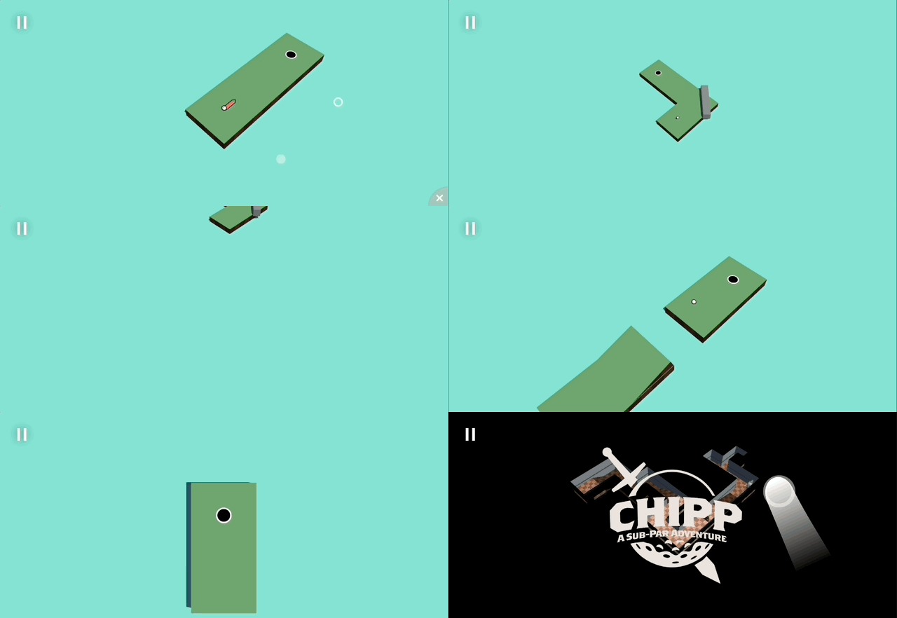
In-Development footage of game intro sequence
The Difference in Platforms
Different input devices offer different ways for the player to interact with the game, with each of them having their strengths and weaknesses. Keyboard/Mouse is great for precision inputs, and can bind a lot of different functionalities to the many keys on the keyboard. Touch devices are great at providing a 1-1 relation between the user’s input and what happens on screen, but requires all functionality to be accessible on-screen through a button or gesture. Controllers offer a universal, game-centric input method that gives the analog input of joysticks / triggers, but loses some input accuracy because of them.
With the team wanting to target multiple platforms (PC, Mobile, Switch), we need to support all of these input methods as each one is the main input method for a different platform. Something I felt when testing our first mobile build was the sense of a second-class experience because of the unoptimized controls. This is not an experience we want any player to have, no matter which platform they play on, so optimizing our controls for each platform is key. The controls become even more important for our game because of the focus on how the player moves. Our unique player controller is a big selling point for the game, and ensuring that it feels great to just bounce around the level with it is very important to the player experience.

Initial mobile build testing
Where Were We At?
The game was first prototyped just for PC, with just Keyboard/Mouse controls. This meant we started with the movement being a click-and-drag input, which made up 90% of the inputs to the game. However, once we added our first new ability, a teleport, we needed a way for players to use both. Our solution was for left-click and drag was the regular shot, and right-click and drag was the teleport. This worked fine for Keyboard/Mouse, but once we tried it on mobile, the right-click and drag was triggered by two-finger dragging, a motion that wasn’t very comfortable on a small iPhone screen.
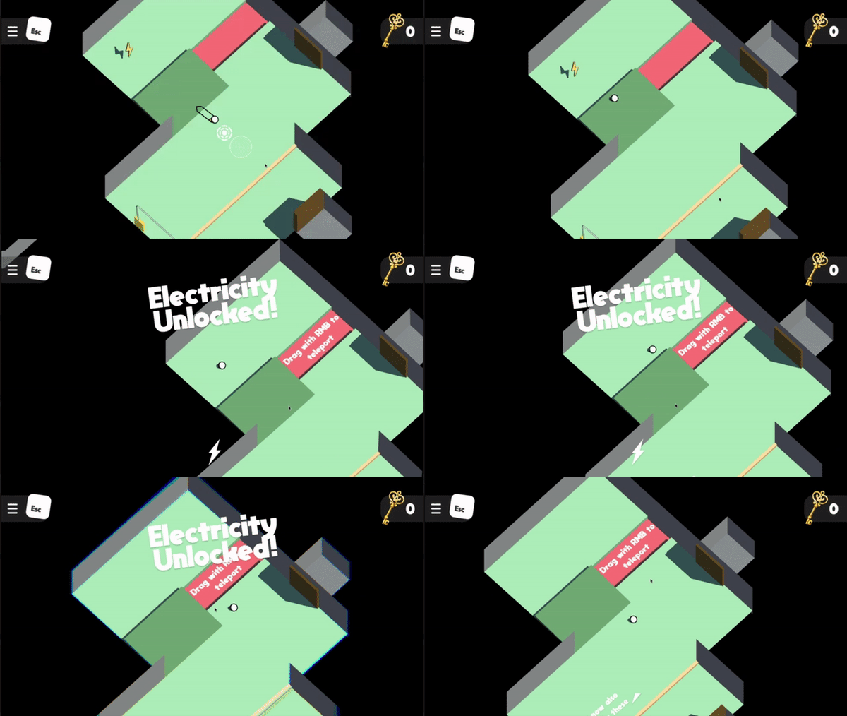
Prototype footage of teleport controls
The Switch to Mobile
The first mobile builds were very promising to us. The movement controls worked almost perfectly out of the box as the click-and-drag from PC became a finger drag, a very comfortable motion for mobile. This led us to focus our design more towards mobile and Switch, which informed my next UI/UX changes. Through my early testing with the build on mobile, I quickly learned that almost all inputs on mobile have to be an on-screen button. As a result, I developed the “Golf Bag” button, which allows you to swap your putter for the teleport ability and vice versa.
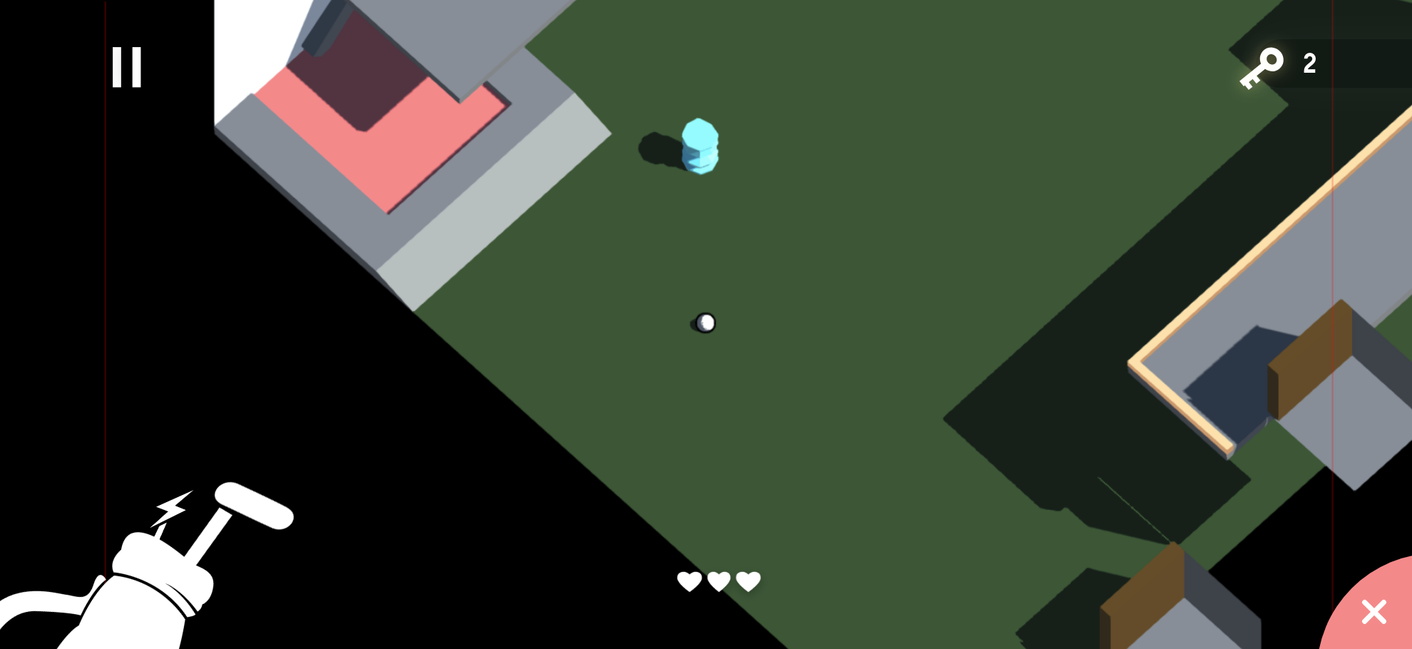
Adobe XD UI Mockup
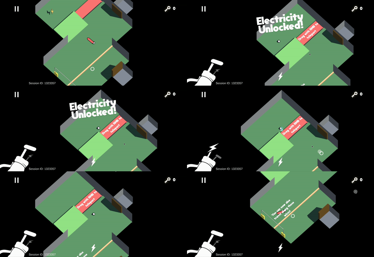
Initial testing of Golf Bag UI
The Golf Bag UI
I started prototyping this UI element in Adobe XD, my UI/UX tool of choice, and was able to iron out the kinks before spending time implementing it in-engine. Because everything about this feature was planned out before starting implementation, it was very easy to pull it into Unity and craft the desired behaviour. Through testing we confirmed that this new button was a much better experience for players on mobile, but PC players seemed to lose something in the process.
When playing the game on an iPhone, you can use both thumbs to play, having one ready in each corner at all times. However, with a Keyboard/Mouse, players only have one input pointer, and that in conjunction with the larger screen, makes it a hassle to have to click on the Golf Bag to swap putters. This makes the Golf Bag button great to use on mobile, but now PC players have the second-class experience we wanted to avoid.
To fix this, I brought back some of the essence of the old, PC-centric control scheme, the right-click. In PC builds, players can now click right-click to swap putters, giving them immediate access to a commonly used tool at their fingertips, just as mobile players get. Through testing, we confirmed that this brought back the great user experience for PC players that we lost in our switch to mobile-centric design.

Easily accessibly areas for landscape phones
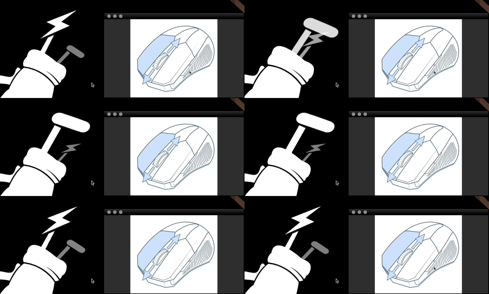
Demo of using right-click to swap putters
Controller Support
At the time when we started to focus more on supporting different input methods, we had no controller functionality, and so that would quickly have to change. My design goals when starting to prototype our controller mapping were to maintain the satisfying pull-and-fire idea from the other schemes, as well as to maintain the ability to perform tricky series of shots.
I played around with many idea for what direction this input could take, such as using the trigger like a sprung-loaded putter, or pulling and releasing the joystick to hit the ball. Although these ideas sounded fun and tactile, they ran into problems such as difficult implementation and being obnoxious to use for longer sessions. Eventually, I settled on using the joystick to aim and select the power of a shot, then clicking the A button to launch yourself forward! This was already feeling pretty great, but I quickly ran into the next challenge, bullet time. So far, it has been easy to determine when a player would want our “bullet time,” where time slows down to help players hit trickier shots. On PC and mobile, it triggers while a shot is being aimed, when the mouse or finger is held down. However, on controller, players would ideally be able to keep the joystick held down, adjusting as needed to their next shot. If I kept using the same idea of “bullet time when aiming,” then it created an awkward experience for controller players where they shot the ball, but never exited bullet time because they were still aiming. Exiting bullet time when shooting and going from slow-motion to full speed especially makes the shot feel more impactful and juicier, and so I wanted to keep that same great experience for controller players. My solution to this problem was to disable bullet time for the first 0.5 seconds or so after taking a shot, before returning into it if the joystick is still held down. This gives players that great sense of impact from their shots, which also getting them back into time slow in time for their next shot.
As for the putter switch action, the controller was able to take a page from the Keyboard/Mouse controls and map a face button to the swap putter action.
In the end, playing the game with a controller is now a great casual way to enjoy the game, however it feels less accurate than the other methods. I suspect this is because the joystick isn’t a perfect 1-1 mental map with the space like the other 2 methods are.
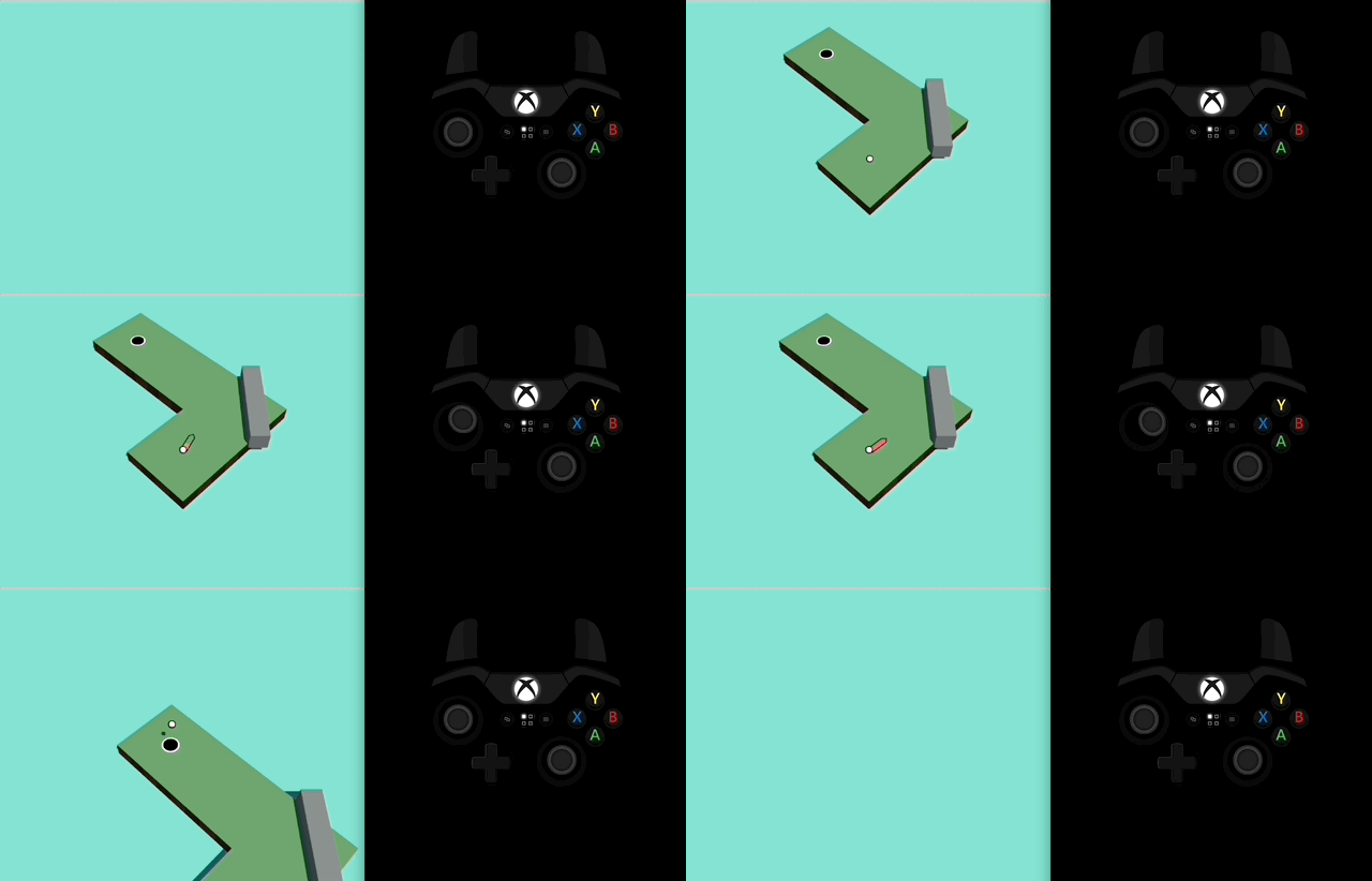
Controller demo
A Seamless Experience
And in case any players on PC wanted to pull out a controller and use it to play, the input method automatically switches depending on which input method the user is using! So someone could just plug in a controller and it would automatically switch to controller mapping, then if they decide they liked Keyboard/Mouse better, they could swap back to it and it would just work!
Next Steps
After all of this, the game now supports all 3 of our targeted control schemes in Keyboard/Mouse, Controller, and Touch Screen! Each input method now feels great to fling yourself around levels with, and none of them feel like a second-class experience, which meets our target design goals. However, there is still further work to be done to call our controller support complete:
· The current controller mappings are for a PS5 controller, which causes the controls to be unoptimized on Xbox or other controllers. We will eventually make a system to automatically detect which controller is being used and swap to the correct mapping.
· Our newly built custom menu system doesn’t yet support controllers.
· UI elements that indicate buttons to press should eventually be dynamically swapped out based on which input method is being used.

UI Mockup for Mobile / PC pause menu

UI Mockup for controller pause menu


