CUPID.
A mobile-friendly puzzle game where you must connect destined lovers.
Team: 2
Roles: Game Design, Level Design (Levels 1-5), Programming, Art Direction/Creation, UI/UX Design
Tools: Unity, Adobe Photoshop
Timeline: 48 hours
Game Jam: GMTK Game Jam 2021
Game Overview
CUPID is a mobile-friendly puzzle game where you attract destined lovers by bringing people together.
The game features simple, one-touch controls and was designed with mobile in mind.
My Work On The Project
Complete Game Design: Concepted, prototyped, and realized a full game design in 48 hours.
Programming: Custom scripted all game functions and built a designer tool for level design.
2D Game Art: Developed a cohesive, clean art style for the game and implemented the look into the game.
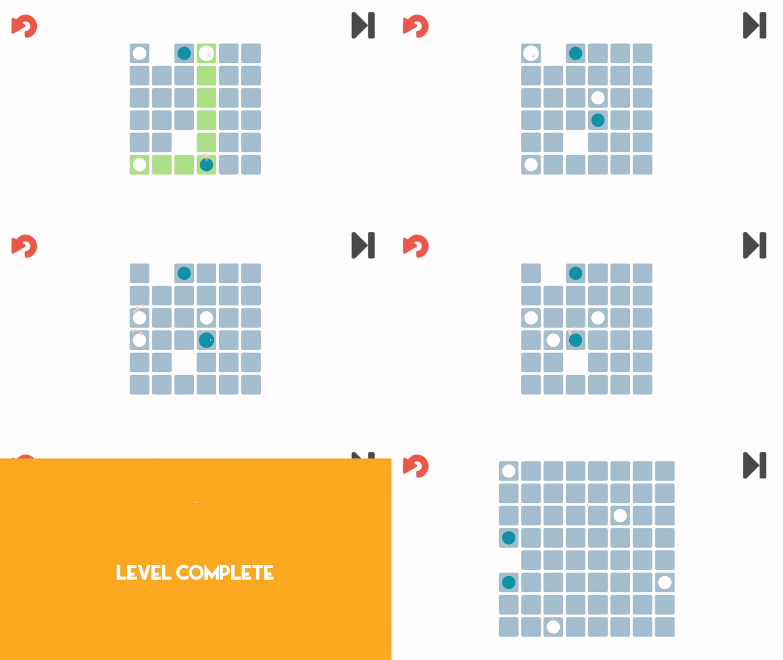
Puzzle Design: Developed the first 5 levels of the game and developed a level design process for fast level creation.
Design Challenges
Tutorialization
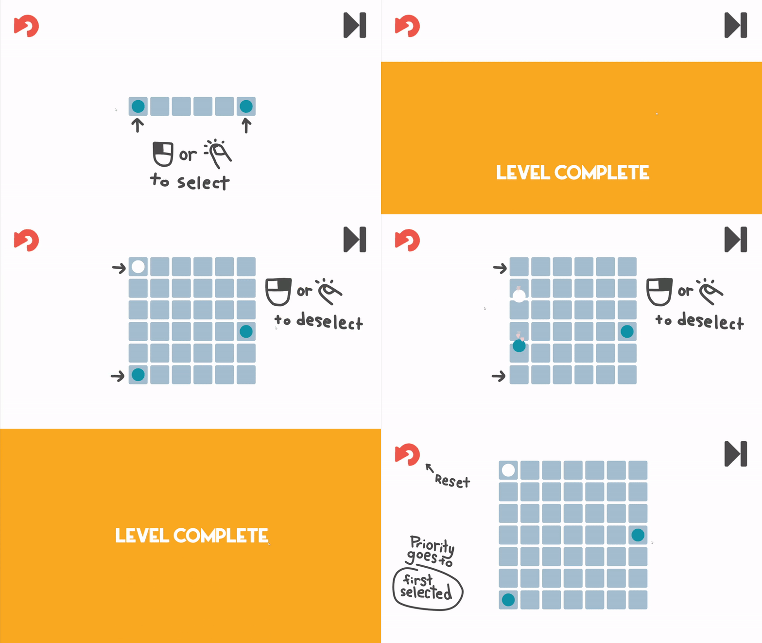
CUPID is a puzzle game with one simple mechanic, tap to select a circle, tap another circle to join them together. Much of the challenge of the game comes from the unique level designs we can create.
Because of these features of the game, I designed the tutorial levels such that they first spend a small amount of time ensuring the player knows the basic mechanics before they can move on, then tricking them into solving one of the most common patterns of the game themselves - the 2 part connect.
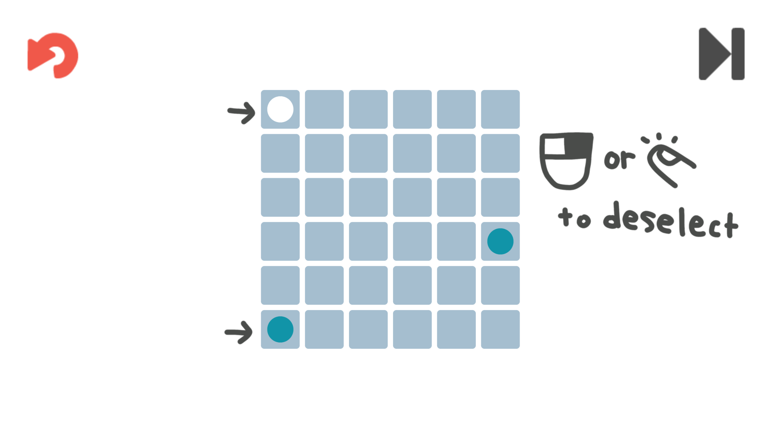
The third level requires the player to rethink the level they just played in a slightly different way as to ensure they understand one of the more niche control options, being able to choose which circle gets priority when moving an odd distance.
Level 1
Level 2
Level 3
User Experience
There were multiple opportunities to enhance the player’s experience just through small UX improvements.
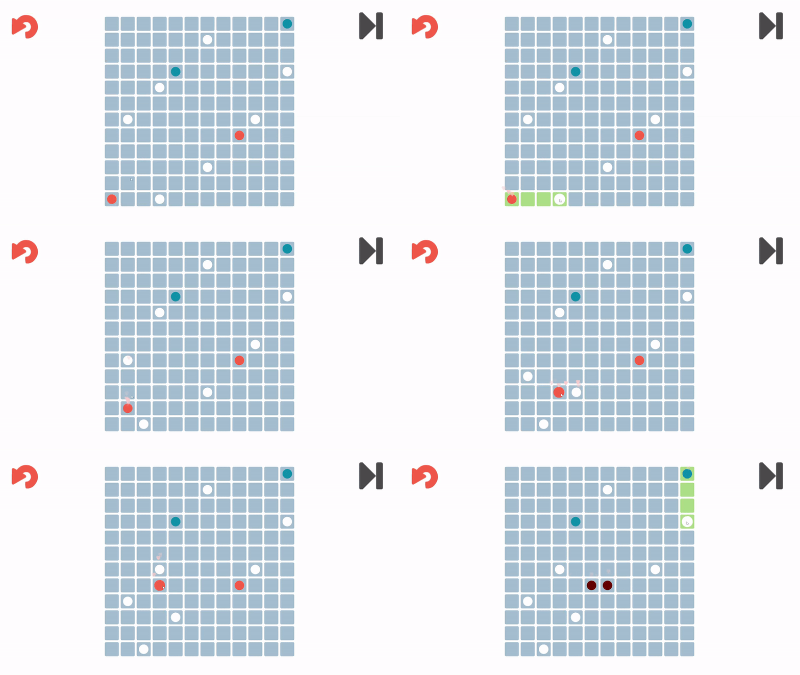
One such improvement was the addition of the “possible move indicator” when the player selects a circle. In playtesting we found that it was difficult to understand what moves each circle could make, especially when other pieces were many spaces away. Similar to an issue seen in some Table of Contents, it becomes hard to quickly find which row each circle correlates to.
To fix this, I designed and implemented a feature that highlights all possible movements a circle could make once it’s selected. This addition made it much easier to see a move that might be hidden on the other side of the level, and improved the overall user experience.
Another improvement was the fast, smooth level transitions. Due to the limited attention span of jam-game players, I wanted to remove any bloat from the game and get users to experience all of the content as fast and intuitively as possible.
Therefore, we forewent a level selection screen for a faster, hidden transition between levels along with a skip level button. The transition feels very smooth and adds a lot of polish to the experience as noted by reviews of the game. The skip level button also supports the design intention of fast gameplay as it allows players to skip any levels they can’t figure out in their short playtime and allows them to experience more of the game rather than them just exiting the game out of frustration.
Take Aways
Experienced a small-scale game production over the course of 48 hours.
Explored puzzle design from level 1 all the way to tricky challenges
Developed important UX features to enhance player experience


